Family Photo Color Schemes
Choosing Colors for Your Family Photos
Outfit choices can be one of the hardest things about having family pictures. What will I look good in? How to make everyone’s outfits look good together but not so matchy matchy like white shirts and blue jeans. Color is the place I like to start with coordinating outfits and because it’s the most important for making you look your best in photos.
Table of Contents
Pick a Color Palette For Your Skin Tone
I have experimented a LOT with clothes and allll the colors. But instead of spinning the color wheel to choose family outfits, I’ve found it’s best to start with colors that really compliment my own skin tone. Muted creams, super pale pinks, and tans are popular in a lot of family sessions but with my cool skin tone and dark hair, they make me look ill, but someone with lighter hair and a warm skin tone would look amazing. So for each of my clients, I always start with colors they love AND that really highlight their own coloring.
Colors Can Change The Mood
The color combination you choose can really effect the feeling of your photos. If you use light, neutral colors then the effect is very gentle and more feminine. If you choose bold, jewel tones like forest green, burgundy and charcoal gray, then the feel of your family pictures will be more mature, british library vibes, which could be great for fall or winter photos but may not fit as well in the summer.
Are Neutral Colors Better?
Like I mentioned before, neutrals are definitely having a moment in family photos. But as I said before, make sure to choose a neutral that works with your skin tone and each family members. You do not have to have everyone in the exact same shade of cream. After choosing mama’s outfit (always start with mom.), then pick different shades that compliment her choice but still look good on that family member.
So say, mama, you chose a soft cream dress, your husband could wear a white henley shirt, and your 4 year old could wear, a light tan, and baby could be in another shade of white or tan. Or if light neutrals arent as flattering, you could go with shades of navy and gray, etc. I think one reason neutrals are so popular is that they’re lower contrast and can really help your face bring the most interest to the photo rather than your clothes. Black is technically a neutral but I wouldn’t recommend it for a softer look unless you have darker skin so the contrast isn’t as great.
Bold Colors Can Work But Be Careful
So everyone is doing neutral color schemes, does that mean any bright colors are out? Not at all, BUT you definitely have to go with a solid or low contrast patterns otherwise they can distract from the faces of people in the photograph. I love ALL the color in my daily wardrobe (I have an orange tulle skirt that I wear with a graphic t-shirt to the grocery store. lol) but I have learned that making choices that really let my face be the focal point are best for photos.
So a bright rainbow striped sweater is going to be much more distracting that a solid sea foam green one simply because it’s drawing the eye with lots of contrast. If you want to use bright colors, just make sure they work with each family member’s complexion and keep them as a solid color with nice texture to the garment. And as fun as they are, I would avoid super neon colors, or bright red since they can cause weird color casts on your skin and make it hard for your photographer to edit for the best skin tones.
Keep Patterned Clothing Subtle
Patterns are beautiful and fun BUT all the variety and interest draws the eye to them instead of to people’s faces. Which is totally fine for daily life, but in a family portrait where people are the focus, it’s much more timeless to stick with solid color clothing in a great texture, or a more tone on tone, small pattern (so dark green with slightly lighter green little flowers, or blush pink with cream colored dots, etc.) But if you want to keep your color combinations simple, stick with solid colors on clothing with nice textures and details.
Color Palette Examples
Phew! That was a lot of theories and rules about contrast, color schemes, and skin tones. So let me show you a few examples of all that in action and give you more color schemes for family photos.
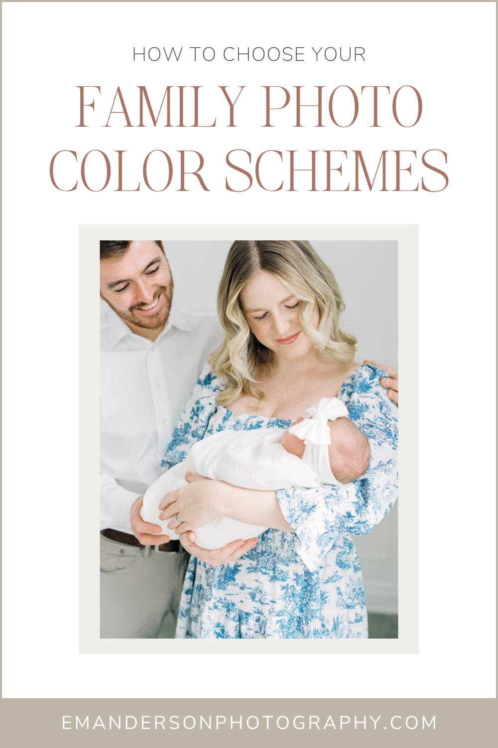
Blue and White Newborn Session
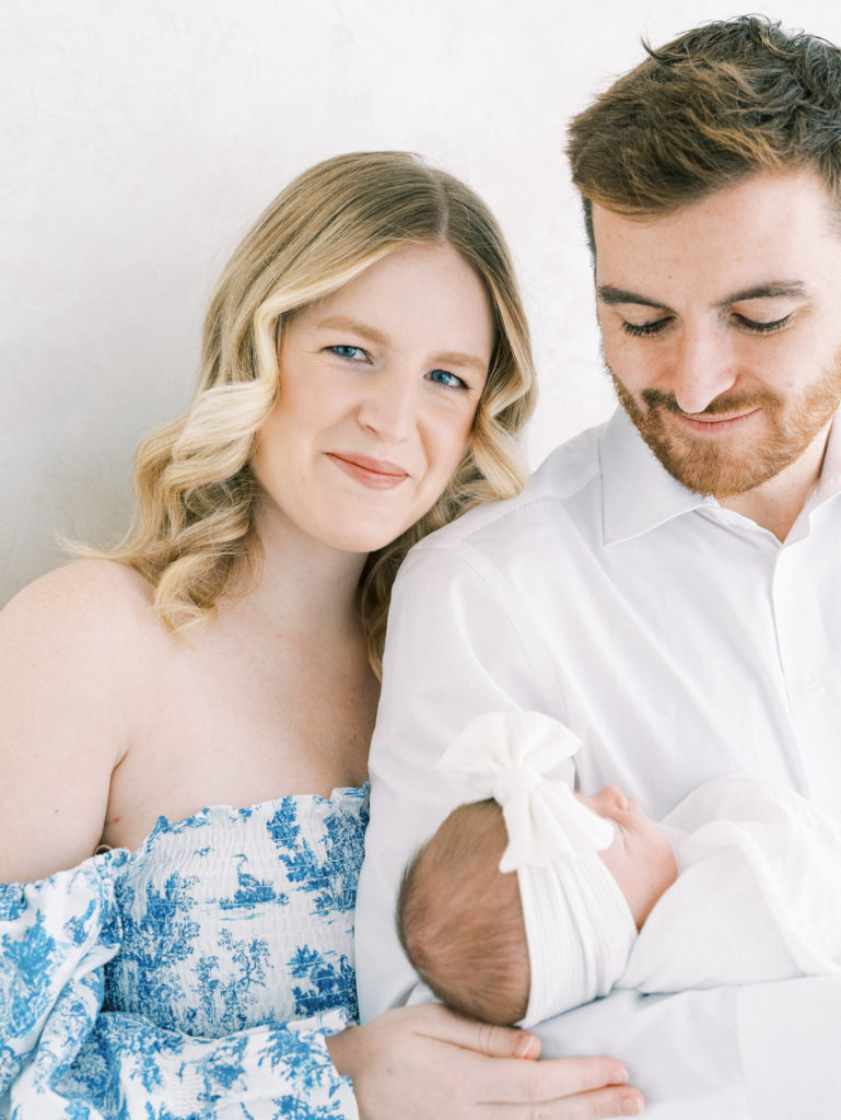
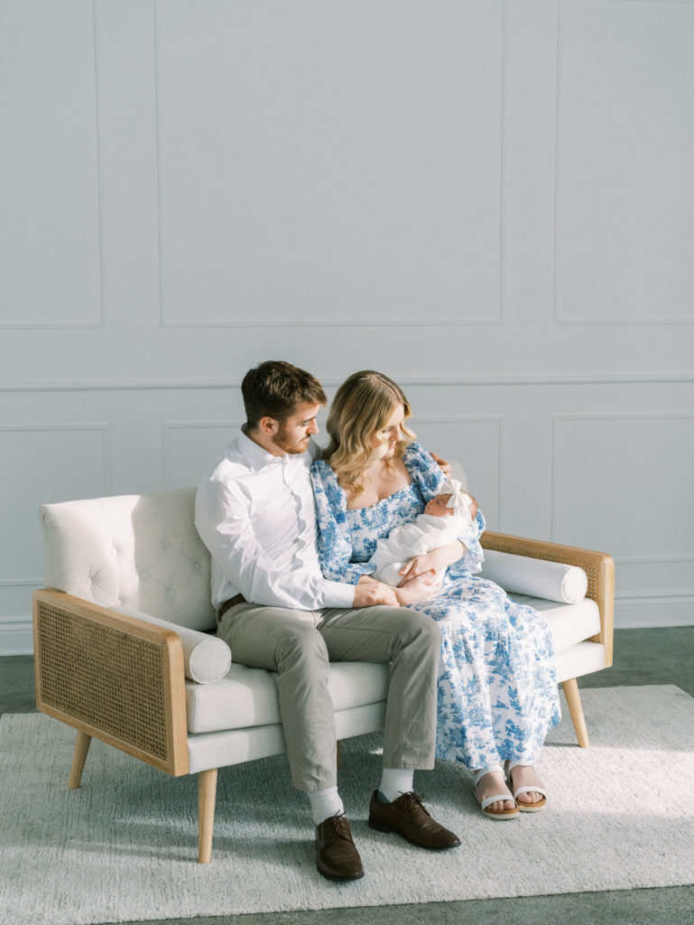
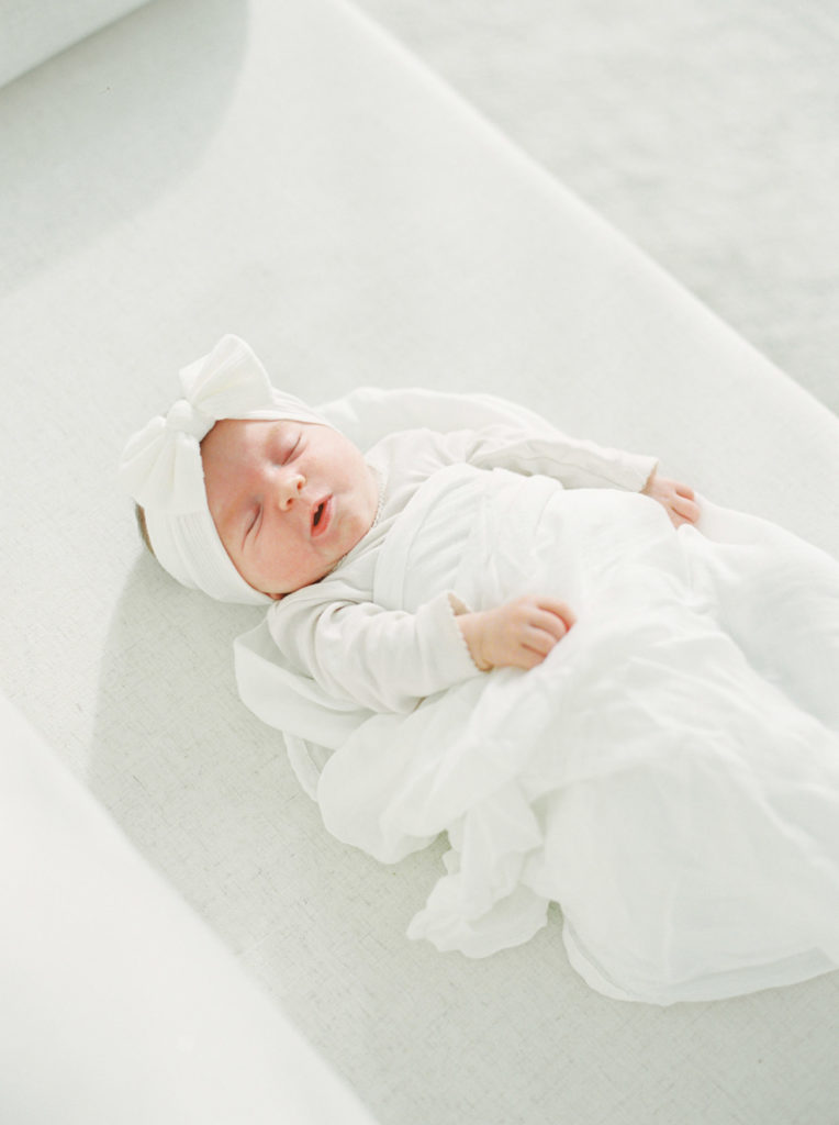
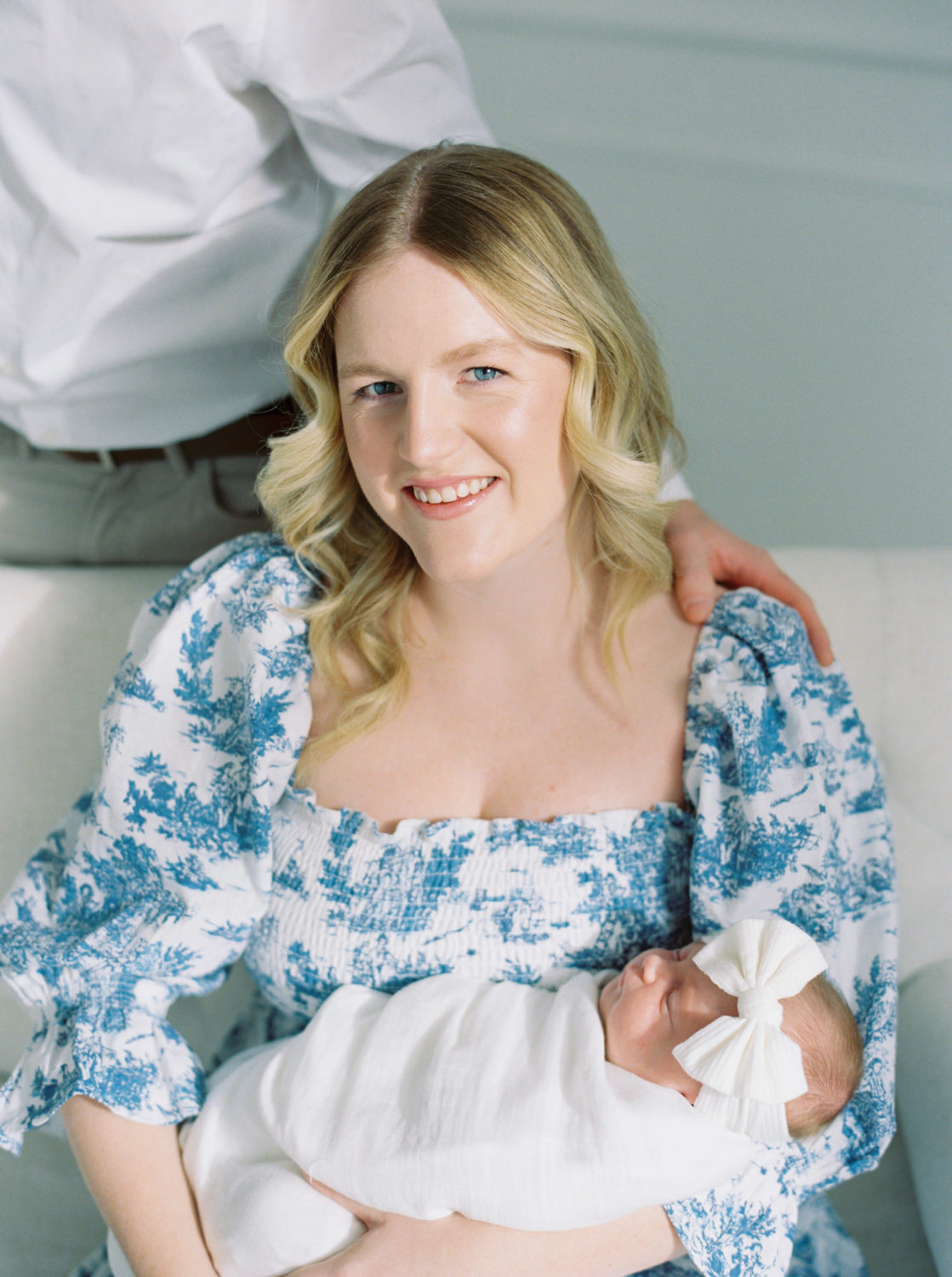
Blue and white are one of my favorite family photo color schemes because everyone can find a shade they look good in. This new mama would have looked washed out in a tan or cream but this bright blue and crisp white really make her skin glow and bring out her eyes. And to keep the scene looking lighter, we kept baby girl in white and dad in a white shirt. We kept his pants a lighter color instead of navy or black to not add too much contrast to the color palette. Normally prints can be tricky, not knowing how they’ll age, but the french toile is so classic and will help keep their beautiful photos looking timeless.
Green Patterned Color Scheme
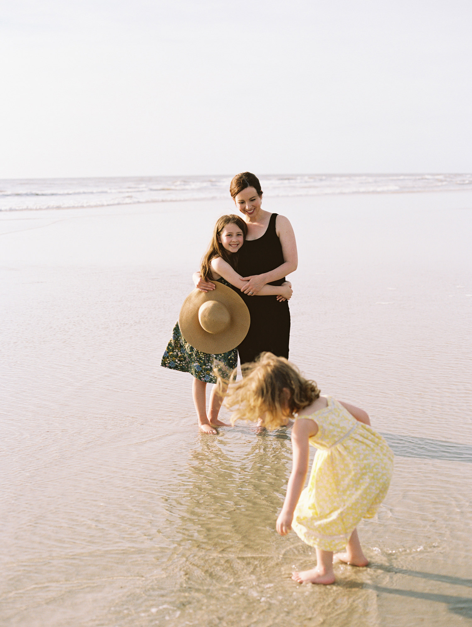
In these spring family pictures, instead of mom’s outfit dictating the outfits, all of the color decisions have come from the oldest daughter’s dress. Mom chose to wear neutral black so that left the deciding color scheme to a different person. If you look closely at the pattern on the daughter’s dress, you can see how all the other family outfits are chosen from there. Dad’s olive green shirt, little sister’s muted yellow sundress, and baby’s blue and white striped romper all come from the color scheme of the dress. Mom and dad are both is solid colors and the girls, though wearing patterns, are either small scale or tone on tone so it keeps the whole family looking coordinated and picture perfect.
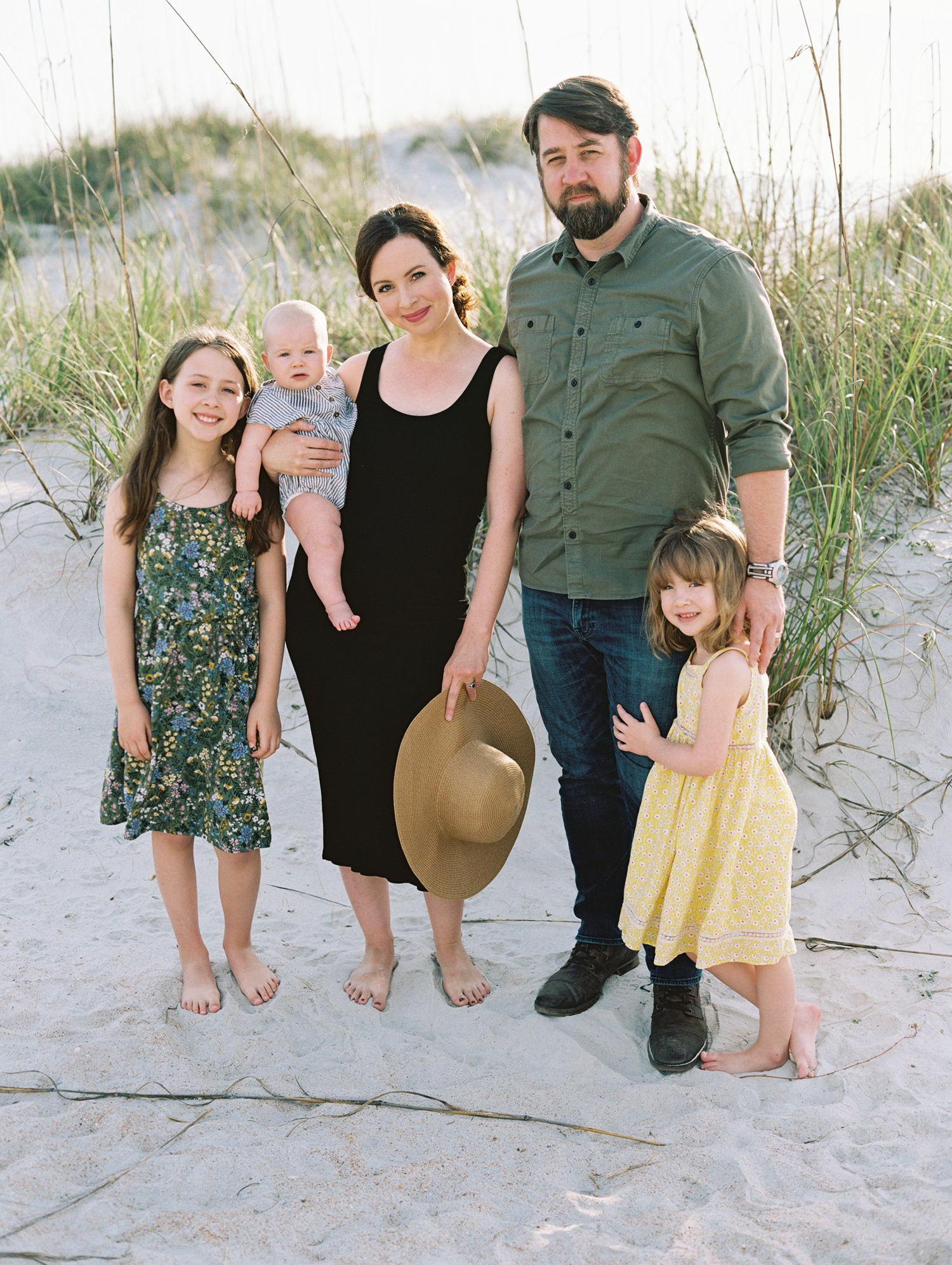
Baby Blue Family Photo Color Scheme
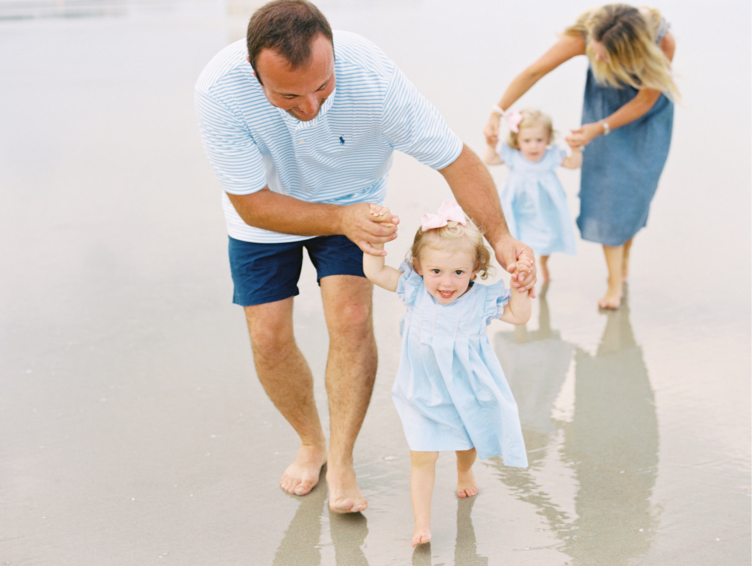
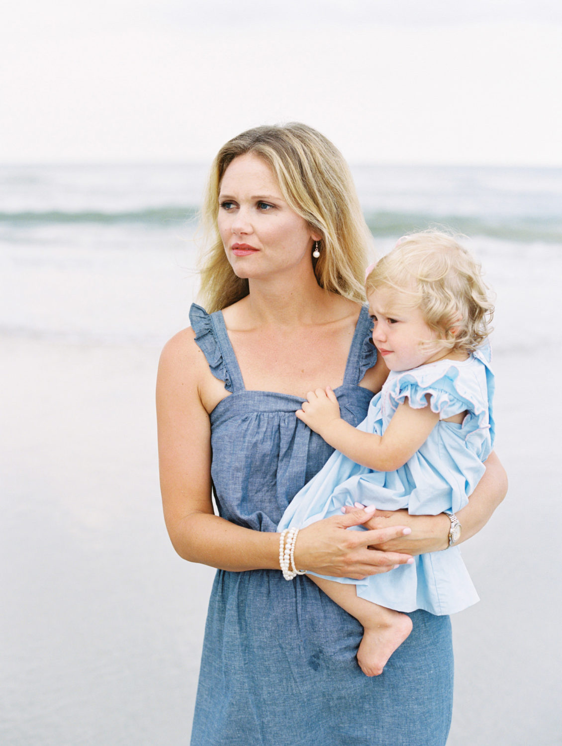
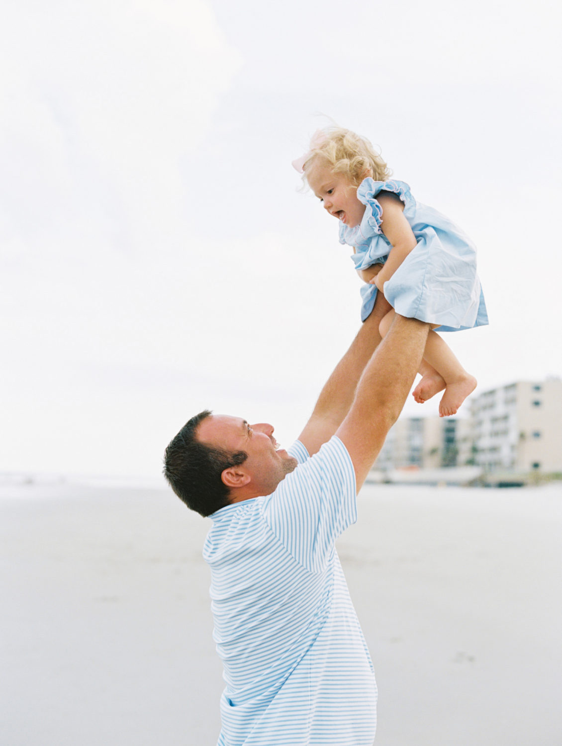
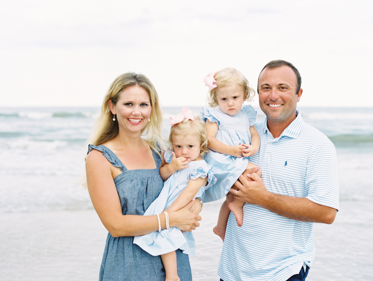
These soft baby blues hit just the right note for casual beach vacation family photos. The twins matching solid dresses avoid looking too plain with nice ruffle sleeve details and pretty seaming on the bodice. Mom’s dress is simply a darker tone of the girls’ outfits, and dad keeping it casual with his striped (but thankfully low contrast) polo shirt. I really like the nice pop of color that the twins’ pink bows to bring to add a little break from the blue. But the whole vibe is gentle and classic.
Rust and Neutrals Color Palette
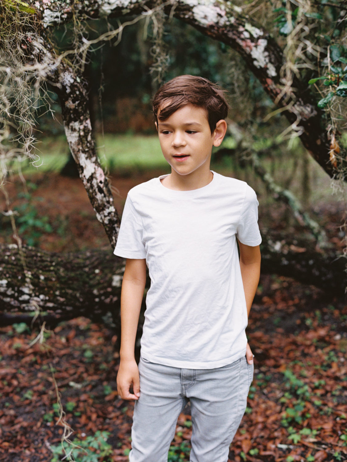
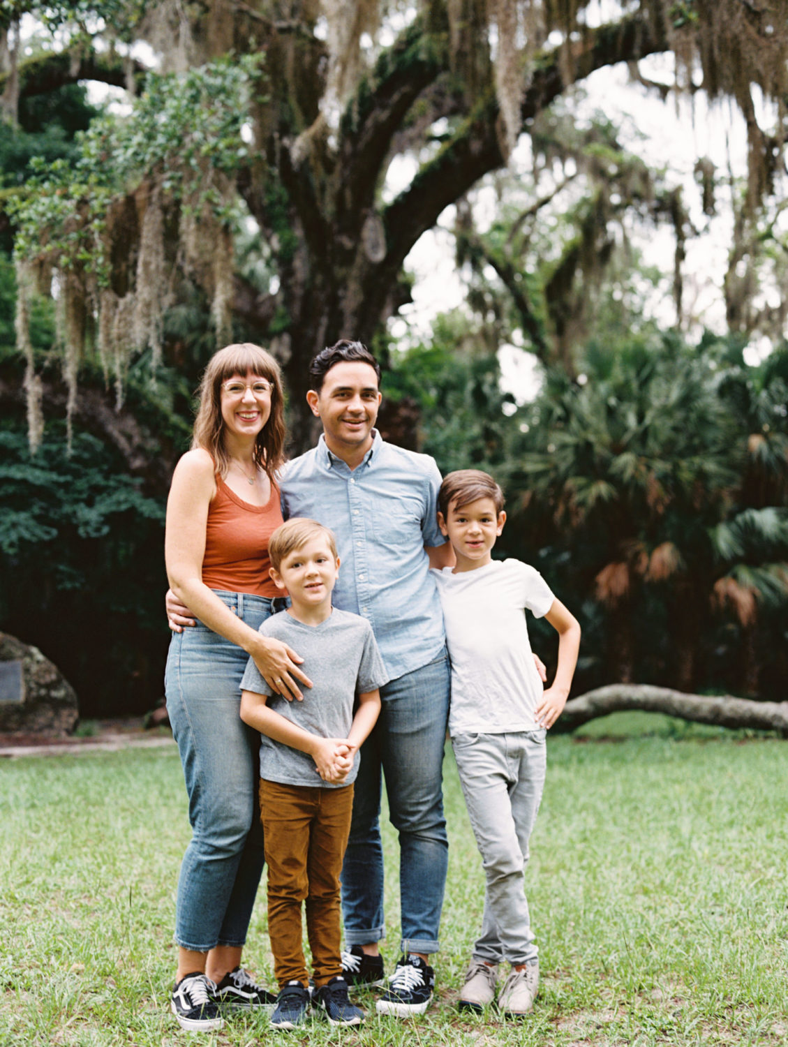
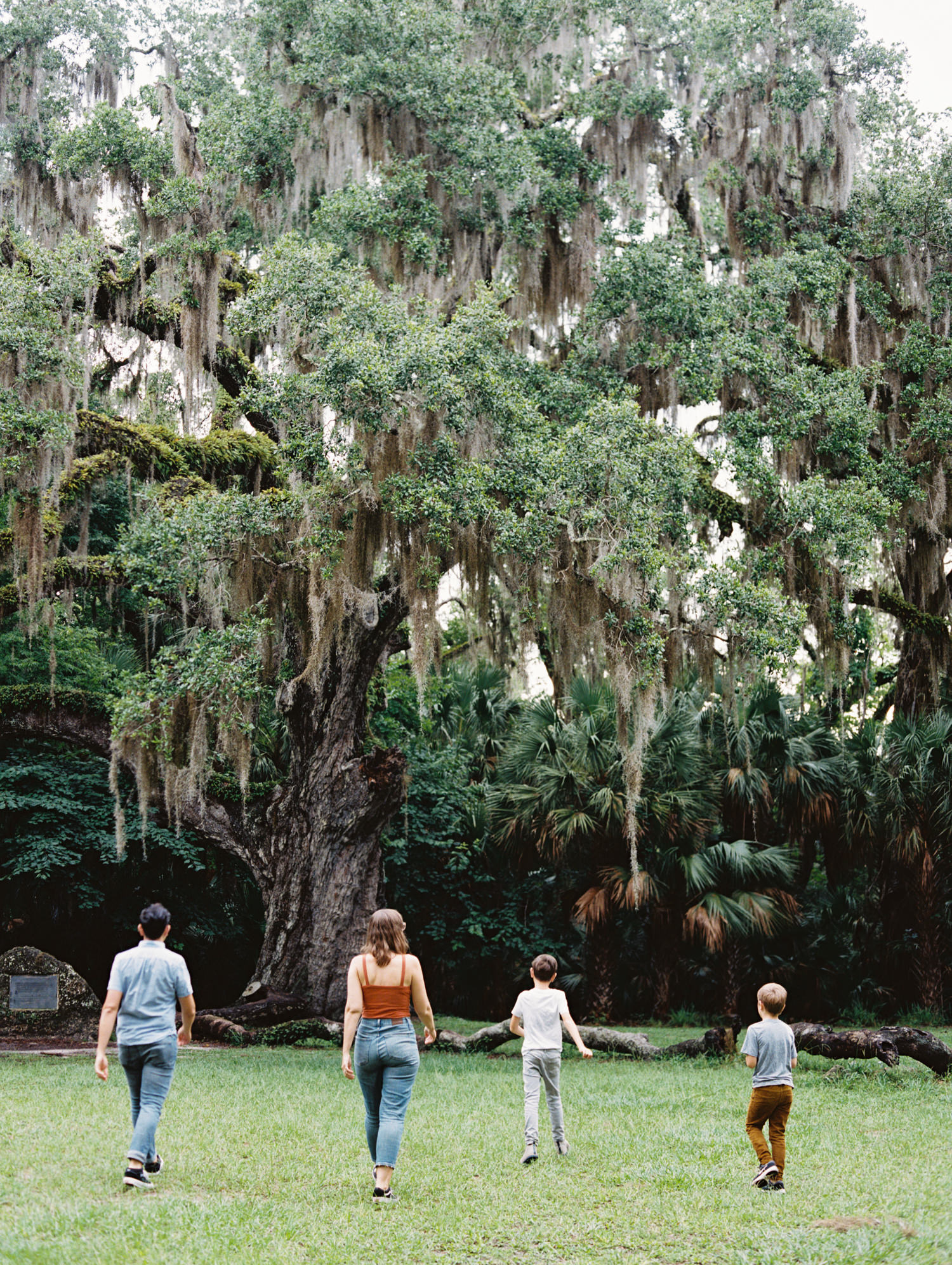
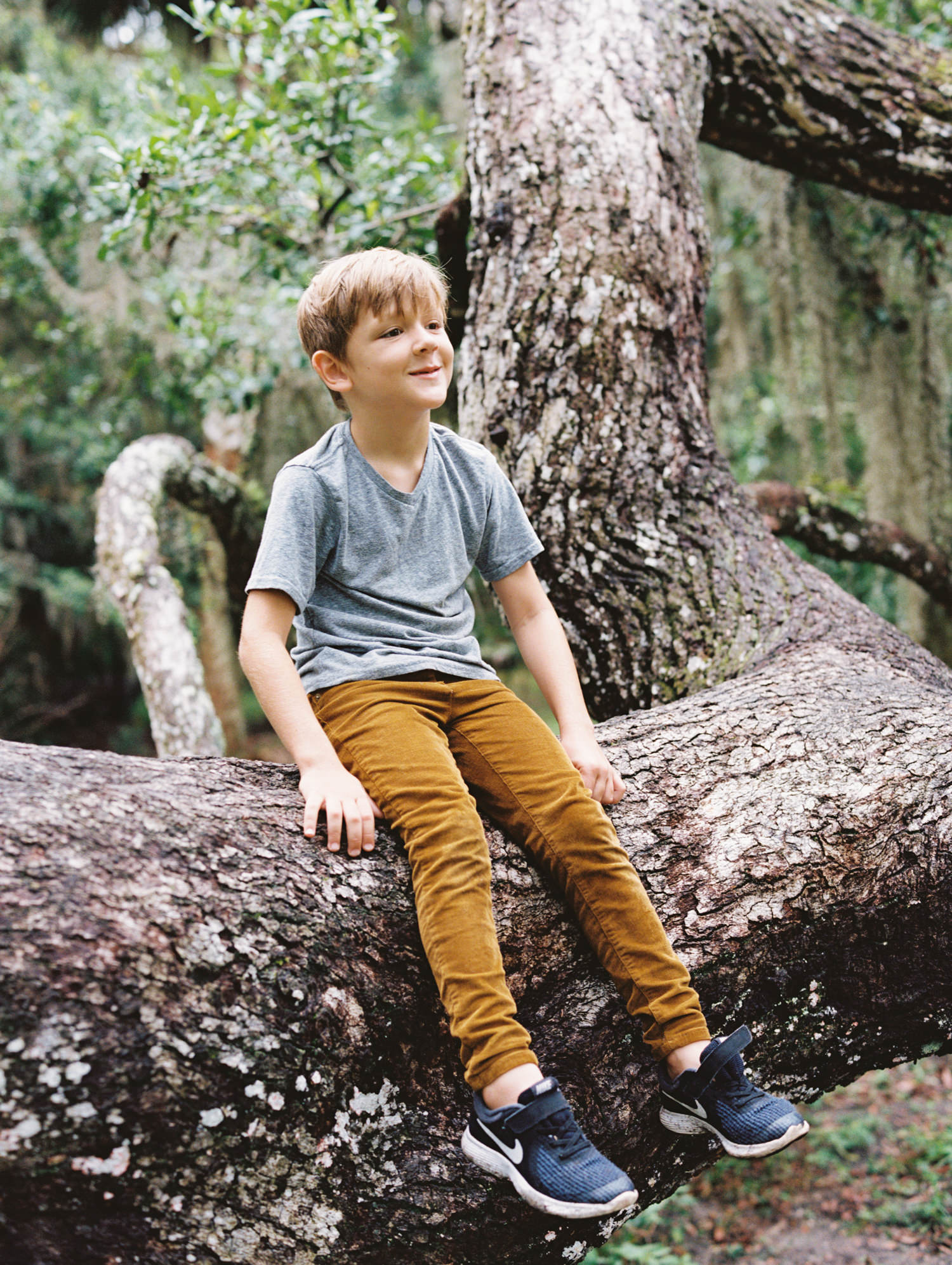
This family wanted to keep things super casual and earth toned for their summer outdoor family pictures. Mom chose a rust colored tank top and high waisted jeans so the key after that was to make sure the outfits didn’t match too closely. Dad also wore jeans but the oldest son was in light gray pants and the youngest was in brown (which connects with mom’s shirt color). Making sure all the pants don’t match helps to avoid the everyone-in-white-shirts-and-jeans-on-the-beach look. And the she kept the boys in solid neutral shirts of white and gray (it can be SO hard to talk them out of graphic tees but it must be done. lol), and dad’s shirt was a light blue which compliments the rust tank top well. All of it worked together perfectly for a casual, effortless family session.
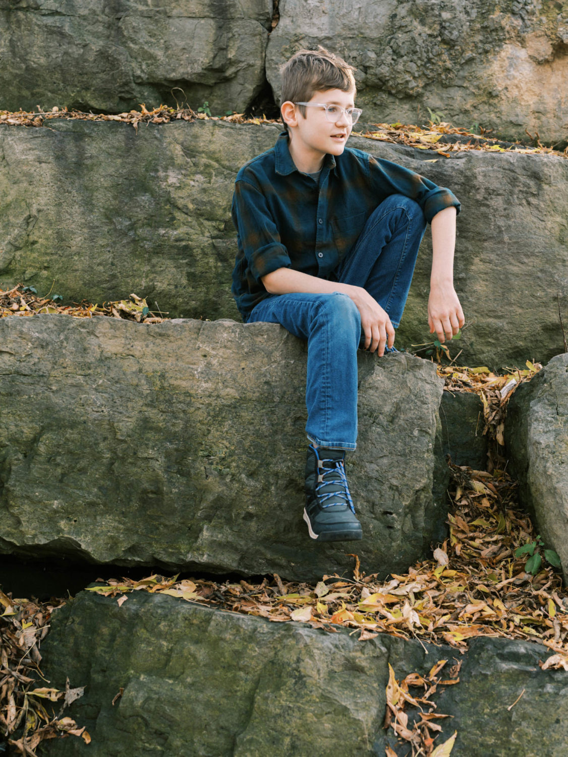
Tan and Dark Neutrals Color Scheme
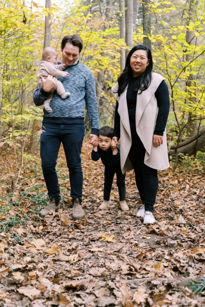
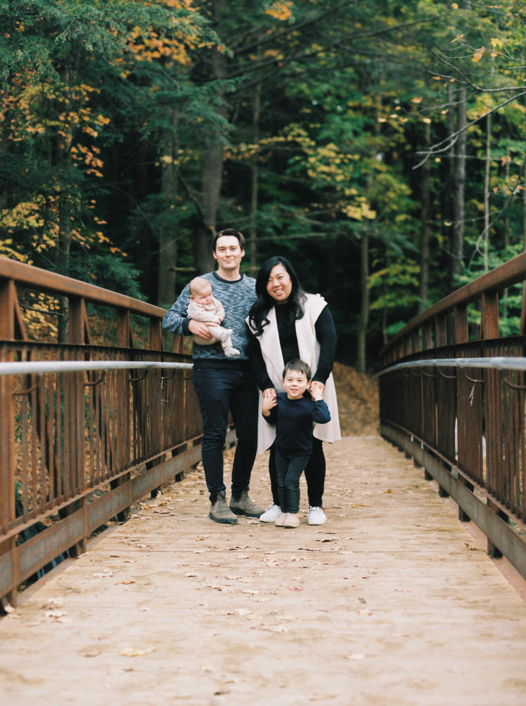
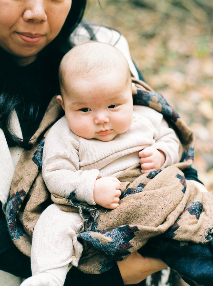
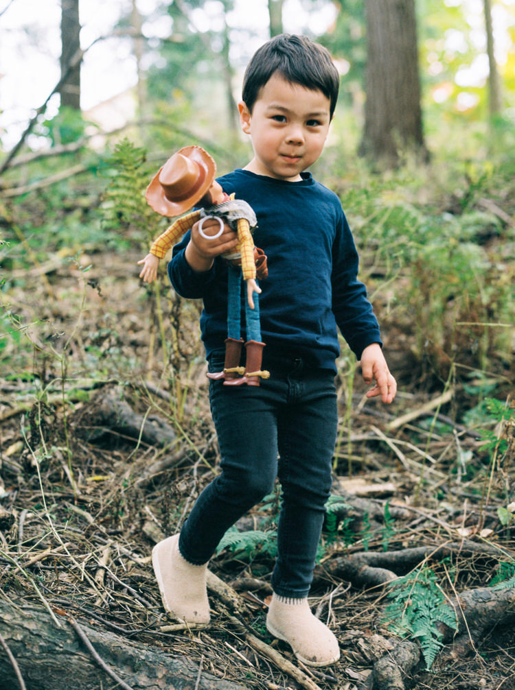
When doing a fall session, keeping your outfits more muted is key to letting the fall colors stand out. This family chose tan, navy, and black for their outfits, putting mama in black with a tan sweater which was great for her skin tone. Dad was more pale so stayed in navy, as did big brother (you have to match Woody after all!), and baby girl coordinated well with mama with a tan onesie and blanket. If you’re looking to keep your colors more muted, but also darker, than this is a great option.
Click here to get more Family Photo Ideas for Your Family Photoshoot and see other family sessions on my blog and website.
If you would love to have help planning your outfits, and even professional hair and makeup, then go to my Contact page to book your free consultation and see if luxury family photography is right for you.